Branding, Logo Design, Concept Development, UI/UX, Messaging, Typography, Packaging Design
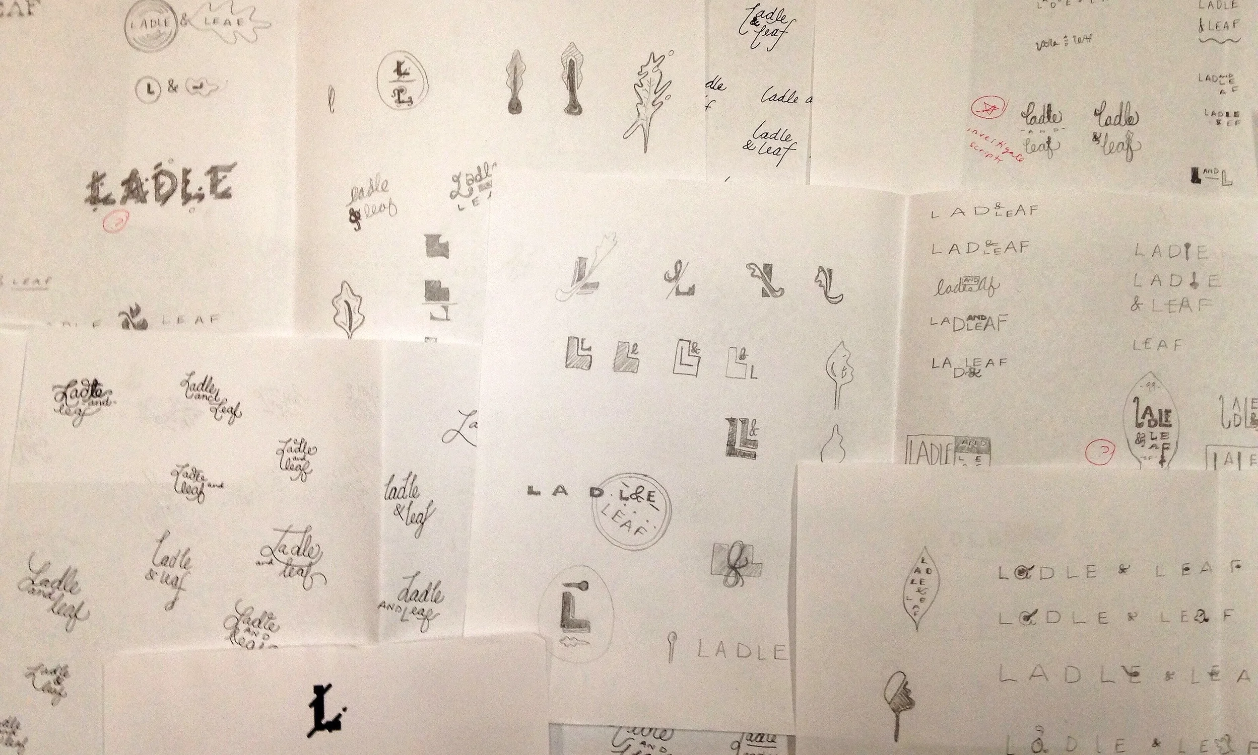
An evolution of San Francisco Soup Company, Ladle & Leaf's goal has been to more accurately reflect SFSC's core belief in seasonal, complex and authentic food. They are a company that has always been doing the right thing, but never successfully letting San Francisco know what they stand for.
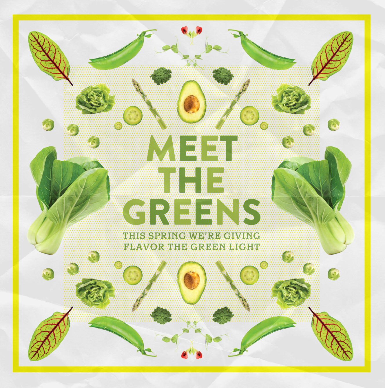
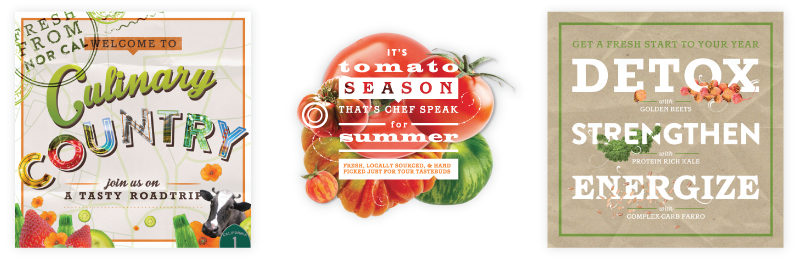
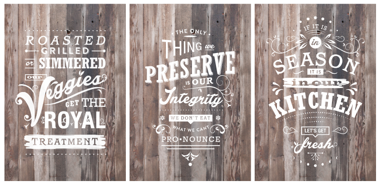
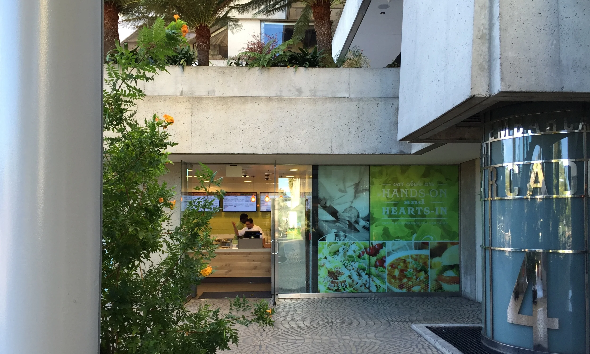
Aiming to be more visually and strategically contemporary SFSC has evolved their brand to 3 new locations this year and more slated to open over the next 5 years. Through a logo redesign, contemporary branding that extends beyond promotional materials and impactful messaging, Ladle and Leaf has become a thoughtful Financial District staple.
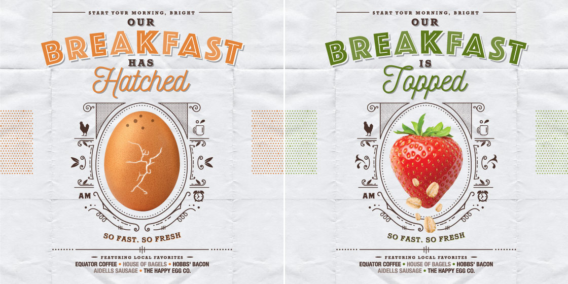
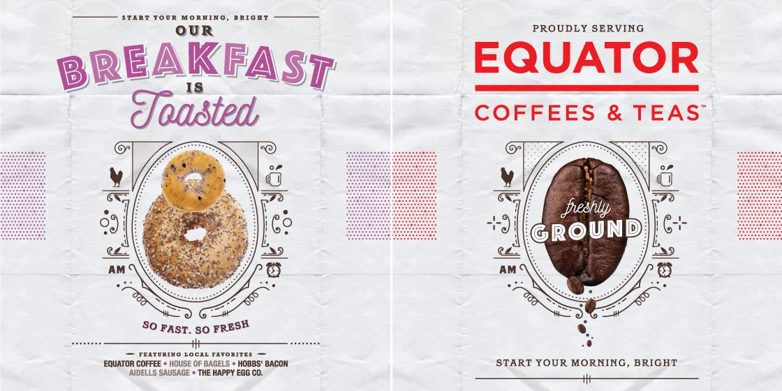
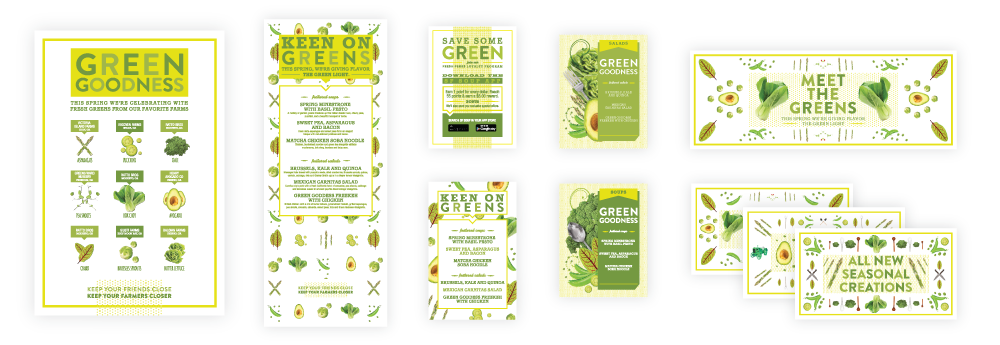
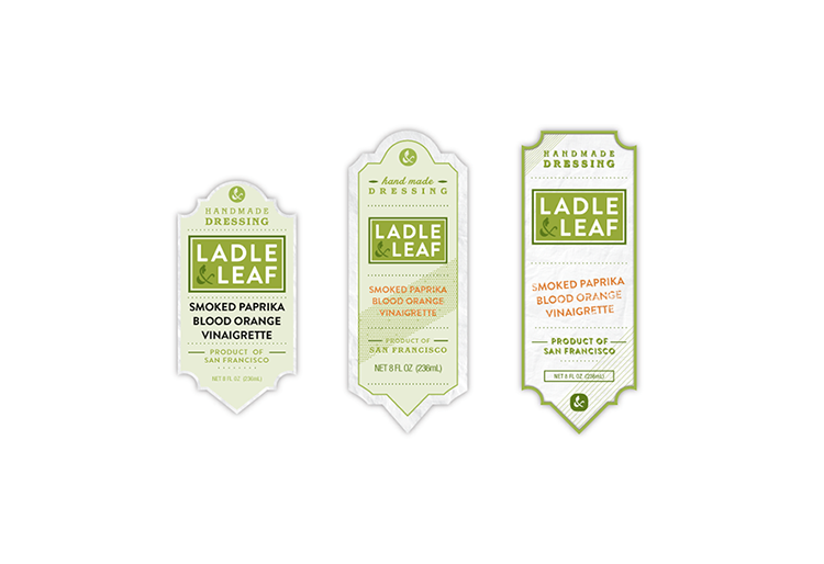
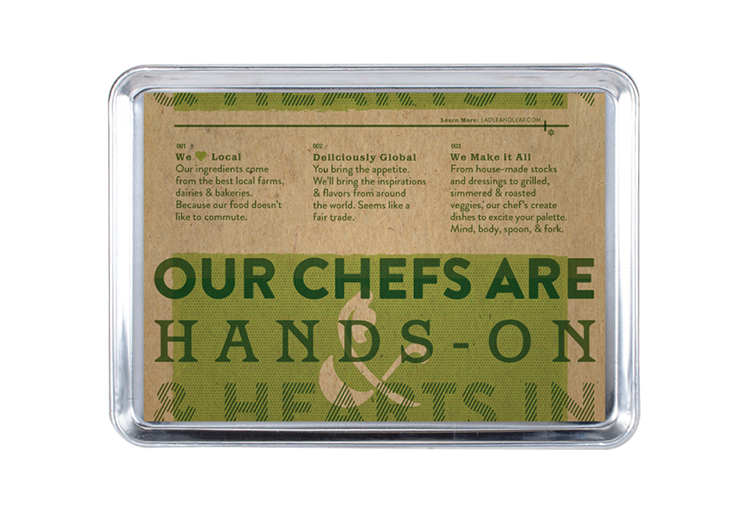
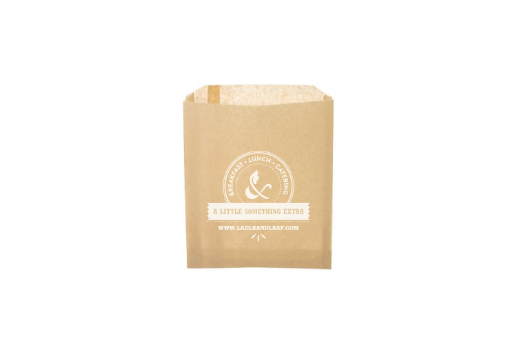
Deliverables include quarterly cycle promotions like unique window, wall, and pull up banners, restaurant packaging, interior and exterior signage, email blasts, and a brand new website all conveying the freshly defined spirit.
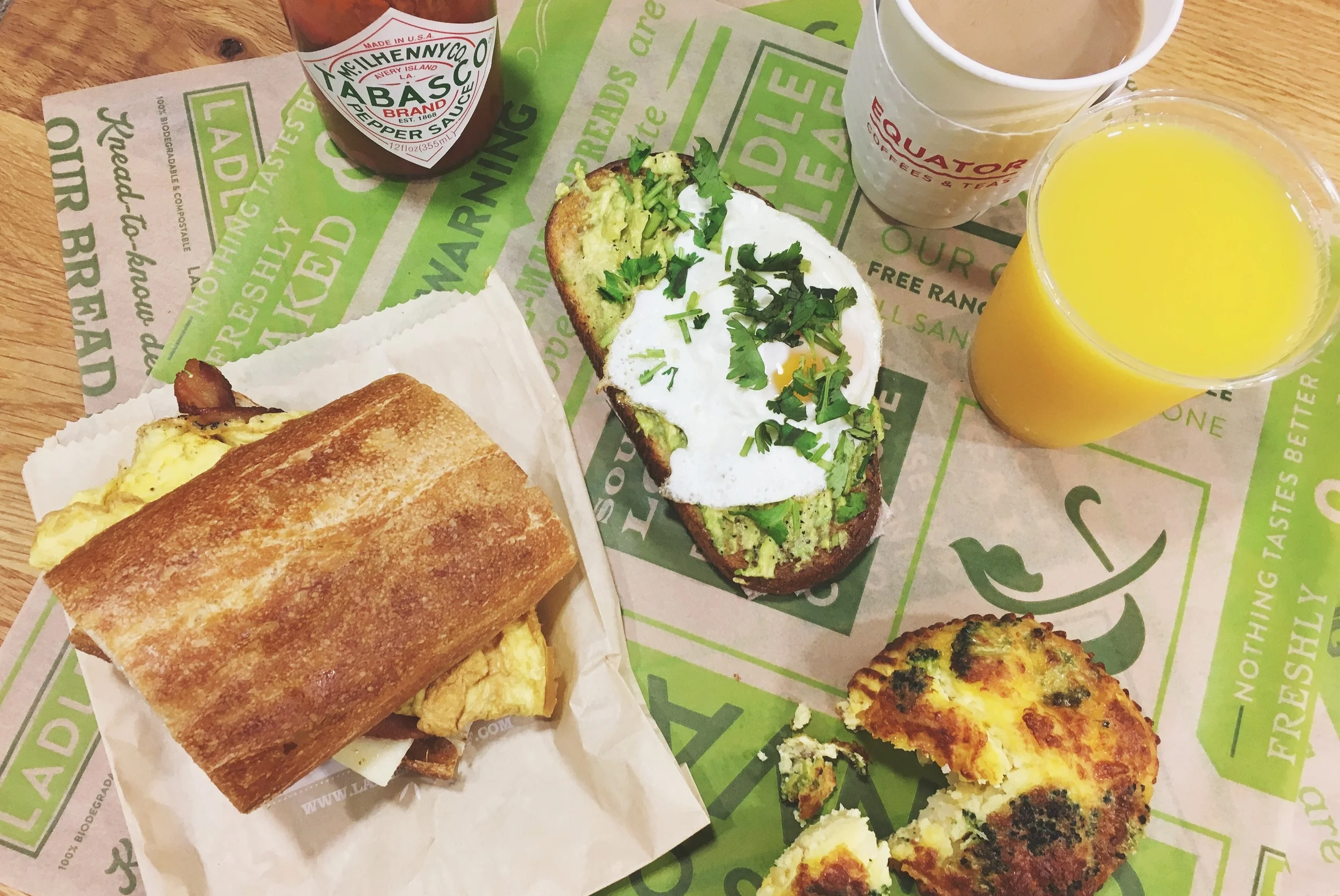
Note: I am a big fan of the Classic Cob Chicken Salad.
Work done at UNIT partners. Art Direction by Ann Jordan and Shardul Kiri.